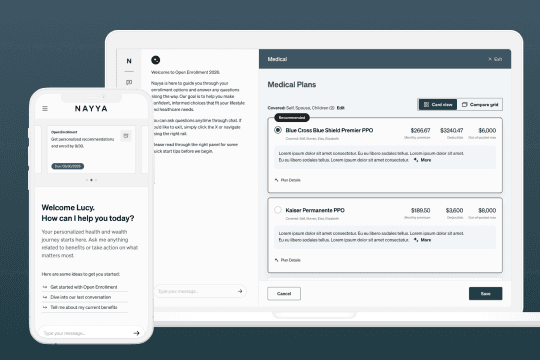
Company
Nayya
Duration
9 Months
Year
2023-2024
Context
At the time of this project, Nayya was a software and data platform that helped employees understand, choose, and use their benefits through personalized recommendations. Since then, the platform has evolved to incorporate AI more broadly across its product offerings.
Decision Support is Nayya's recommendation experience that analyzed an employee's health, financial, and family needs to recommend the medical plans, spending accounts, and supplemental benefits that best fit their unique situation during Open Enrollment (OE).
challenge
During Open Enrollment, thousands of employees relied on Nayya to guide healthcare decisions worth thousands of dollars annually. Even small improvements in trust and comprehension could reduce decision anxiety while increasing confidence in plan selection.
Our research and feedback from partners showed 3 primary problems with the old design.

The "Why" Gap
A major takeaway was that users felt suspicious or "sold to" when they didn't understand the justification for a recommendation
Cognitive Load
The original experience was described as "visually overwhelming," with too many products and too much technical detail crammed onto single pages.
Feature Discovery
High-value tools like "Compare Plans" were buried, and features like the "Scenario Engine" lacked clarity in their calculations.
My Role
Owned the end-to-end product design process, leading strategy, research synthesis, UX, UI, prototyping, and design validation while collaborating with product managers, engineers, and contract designers.
timeline

goal
Overwhelming → Simple
Break dense pages into a guided, step-by-step flow.
Prescriptive → Empowered
Make the "why" clear behind every recommendation, without taking away the user's freedom to choose.
Limited → Scalable
Pair a modular UI with a flexible backend to support any employer's plan data at scale.
design
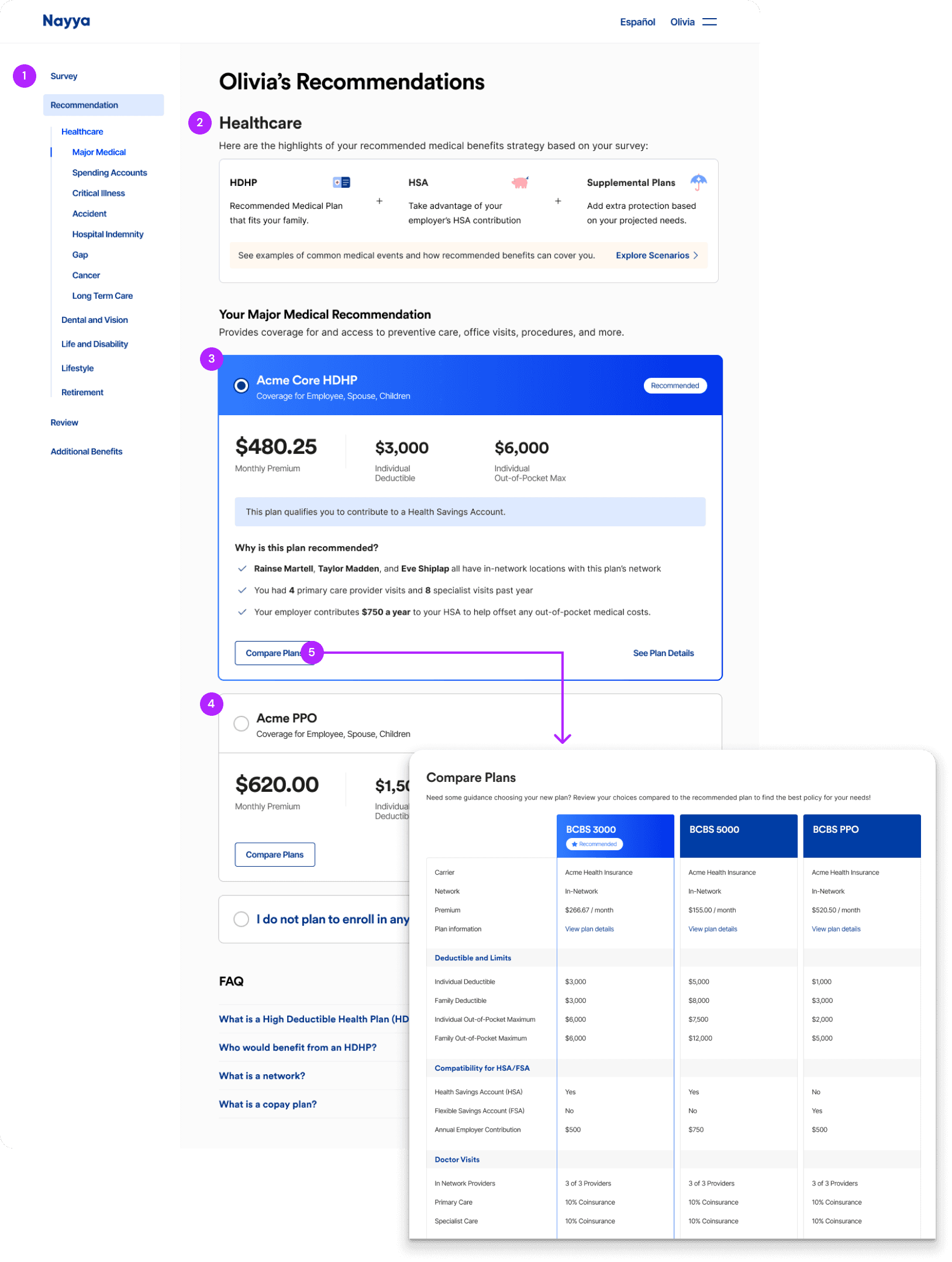
The Recommendation Screen presents personalized recommendations, explains why a plan was recommended, and helps employees view and compare alternative options.
1
Navigation: A persistent sidebar helps employees easily navigate between benefit types and review recommendations without losing context.
2
Strategy Overview: Introduced a bundled recommendation showing how the medical plan, spending account, and supplemental benefits work together, helping employees understand their overall benefits strategy at a glance.
3
Recommended Plan: Surfaced the most important decision factors, including premium, deductible, and out-of-pocket maximum, alongside personalized reasons explaining why the plan best matched the employee's needs.
4
Alternative Plans: Displayed all available plans below the recommendation so employees could explore other options while maintaining a clear primary recommendation.
5
Compare Plans: Added a prominent Compare Plans entry point directly within each plan card, making it easier to access a side-by-side comparison, a feature that was frequently overlooked in the previous experience.

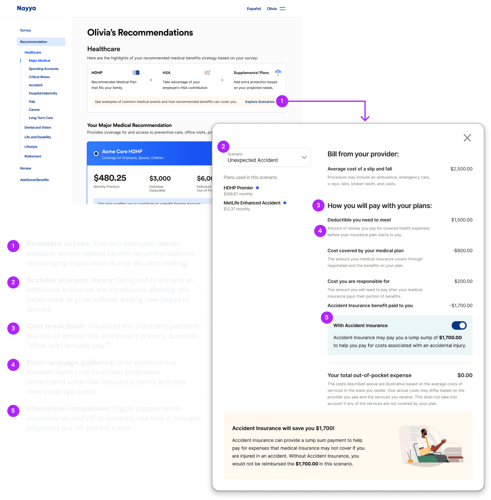
Scenario Explorer lets users explore common "what if" scenarios to understand how different life events impact healthcare costs and how medical and supplemental benefits work together.
The Plan Details page provides a comprehensive view of each recommended plan, including coverage details, costs, and plan features.

Users can update covered members and adjust coverage amounts to view available premium options. The modal adapts to different plan pricing configurations, shown here in three variations.

grid
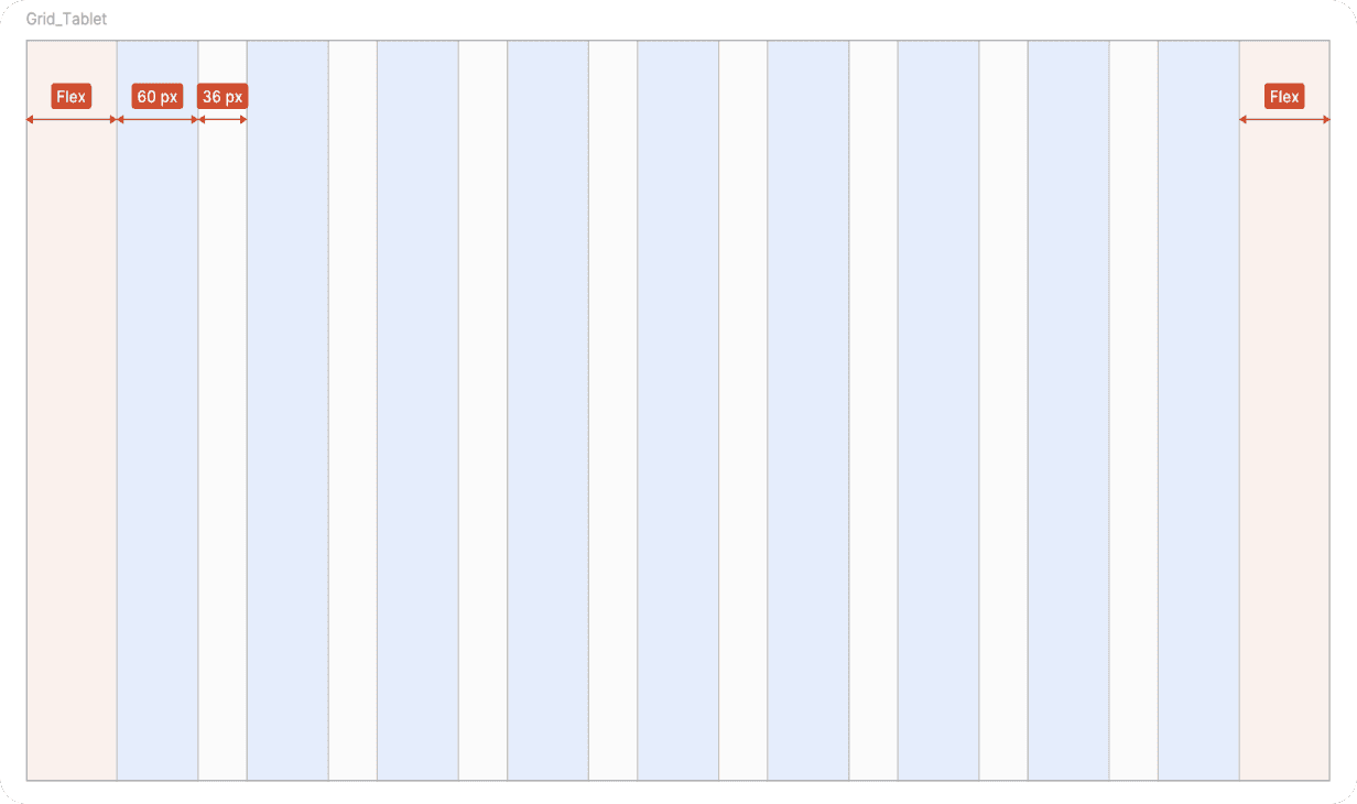
Decision Support was designed primarily for desktop, where most benefits enrollment takes place. A responsive grid system ensured the experience adapted seamlessly across tablet and mobile while maintaining hierarchy, readability, and consistent interactions.
Desktop

Tablet
Mobile

Example
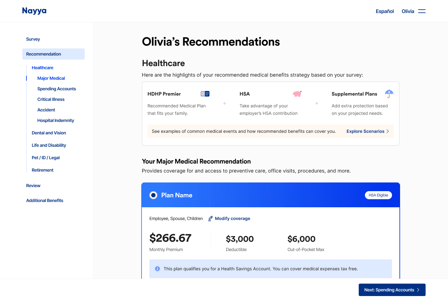


Whitelabel Partnership
Nayya is embedded within ADP's enrollment experience, requiring the recommendation flow to integrate seamlessly with ADP's navigation, branding, and enrollment journey while maintaining a consistent product experience.
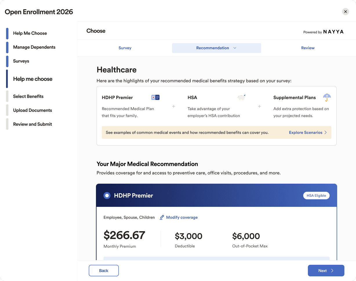
We worked closely with MetLife's design team on a white-label implementation, adapting the experience to reflect MetLife's brand through custom typography, colors, icons, and illustrations

To streamline future white-label implementations, we collaborated with engineers to build a color palette generator that generated the primary color scale from one partner-provided brand color. By keeping semantic colors fixed, we reduced engineering maintenance, simplified partner customization, and created a scalable theming system for future enterprise deployments.

Research & Validation
The redesign was informed by a collaborative research effort across cross functional teams and enterprise partners. Together, we combined foundational research, partner pilot programs, and iterative design validation through usability testing, A/B testing, and feature level experiments to uncover key friction points and refine the information architecture, recommendation explanations, and content strategy.
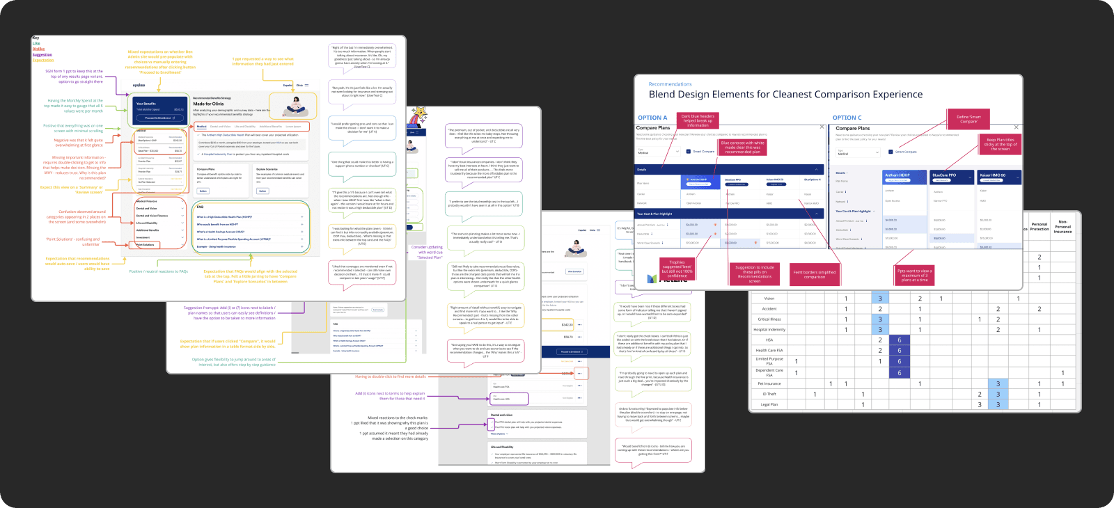
Survey
Collected quantitative and qualitative feedback to understand benefit literacy, user expectations, decision confidence, and overall satisfaction with the recommendation experience.
Internal Pilot Testing
Conducted pilot sessions with employees during Open Enrollment to validate the experience in a real-world environment and identify opportunities before launch.
Card Sorting Exercise
Used open, closed, and hybrid card sorting to understand users' mental models, prioritize benefit information, and refine navigation and recommendation messaging.
Unmoderated Usability Testing
Evaluated multiple design concepts through task-based studies to measure success rates, identify usability issues, and understand user confidence throughout the enrollment flow.
Results
The redesigned experience increased employee confidence and trust in benefit decisions.
63%
Felt more cared for by their employer
67.1
employer NPS during the initial rollout
(Target: 40)
4.6 / 5
Overall experience rating
4.3
Average confidence score after using the redesigned experience (Previously 4.0)